Saturday, May 31, 2014

some kind of wonderful

some kind of wonderful
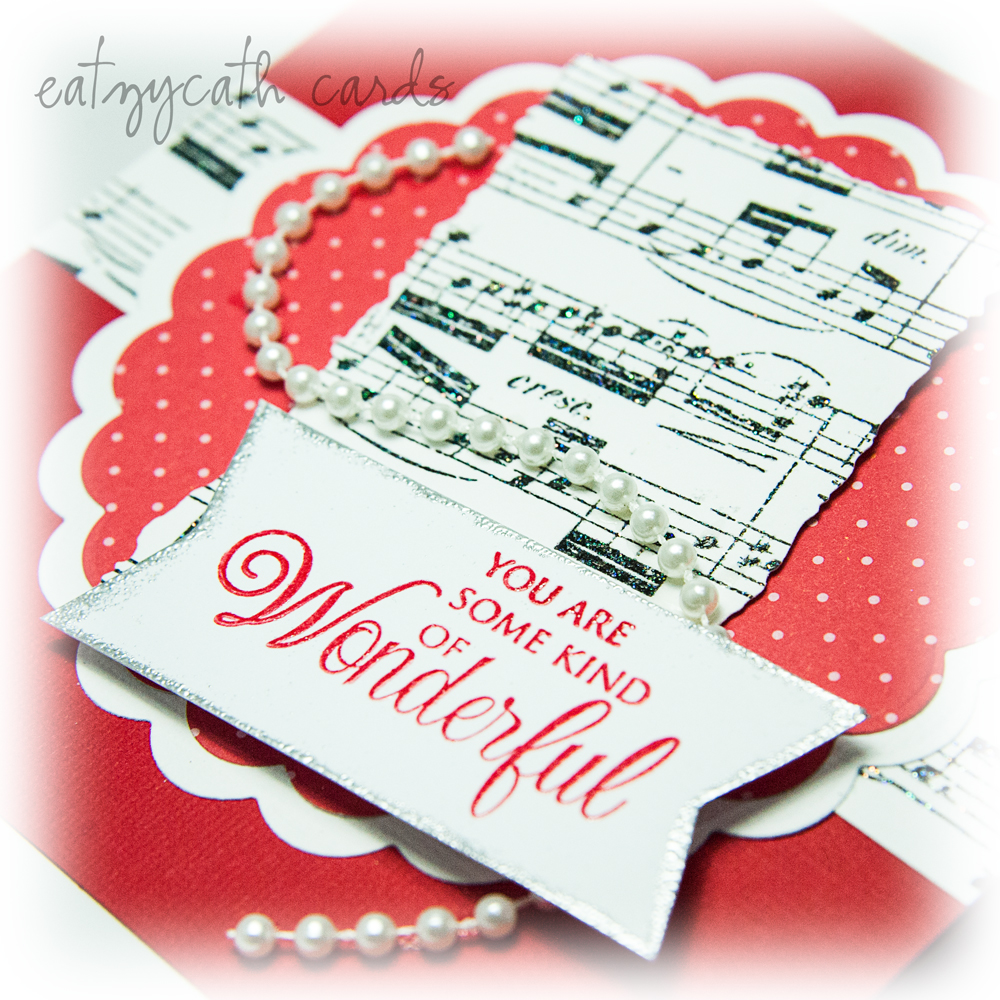
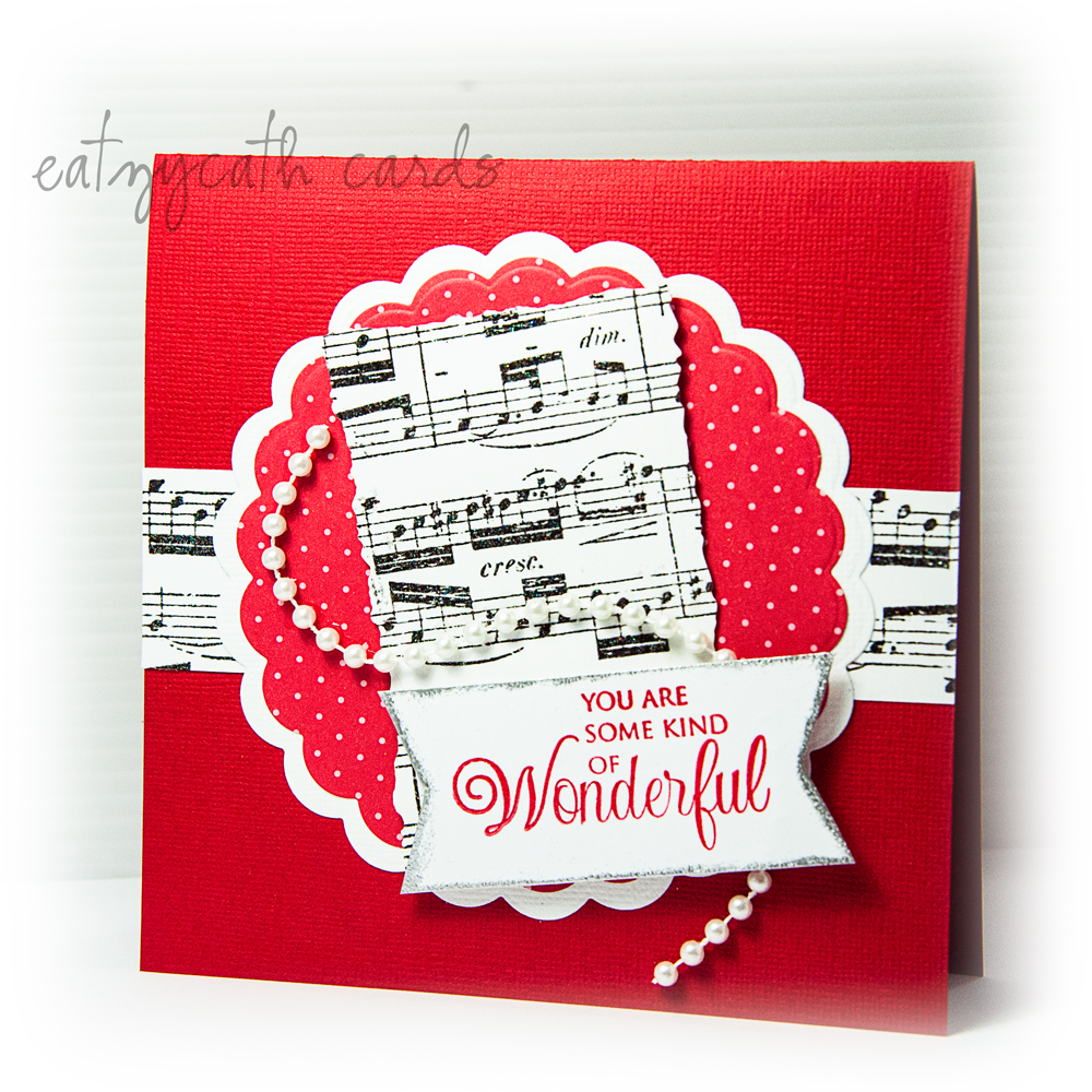
red, white and black are my favourite colour combination, and when they are colours for Fusion Card Challenge (Dinner is Served) - goodness, how could I resist?
the circles are die-cuts on white card stock and red polka-dotted pattern paper - using Lifestyle Crafts Nesting Scallops Dies
the background banner and centrepiece music score was stamped using Hero Arts Cling Stamp - Music Background whilst the sentiment stamp is from Just Rite - What I Like About You clear stamps set


there was a bit of glitter added onto the music notes, which didn't photograph well in the top photo .... so I took another close-up to try to show it (but it still didn't turn out that well) but at least you can see the lovely silver edge embossing to the sentiment tag!

some kind of wonderful

making the years count

numbers
I love this sentiment - so apt especially when one has notched several decades and still counting ... it's such a great reminder of what's important

card design was inspired by Paper Smooches SPARKS May 25-31 Designer Drafts challenge 


using the Paper Smooches Digits and Numbers Dies, I stacked the cut numbers in a semi-circle with the ones on top mounted with foam tape for some added dimension

and a close-up of the stacking numbers
numbers


Friday, May 30, 2014

love in pink

love in pink
a friend's daughter is getting married this weekend, and I love to make wedding cards - with happy endorphins gushing around my system as I picture the couple making this wonderful commitment of a lifetime....... 

card's design and colour combination was inspired by this week's retrosketches challenge #116 and the colour throw down challenge #294 colours (and such delicious colours they are)

the 'Love' sentiment was die-cut using Penny Black's Love & Joy creative die, and inlaid into the beige patterned circle (die-cut using Spellbinders Nestabilities - Beaded Circles)
which was mounted onto the scalloped square (using the die-cut from Lifestyle Crafts - Nesting Scallop Squares)

Monday, May 26, 2014

i like the way you roll .... on clouds

i like the way you roll


with a bit of masking work and some distress inks - the sky background was easily created - for my white and blue clouds and yellow sun to sit on

* the die-cuts are from Lawn Fawn - Large Stitched Journaling Card set and Spring Showers set
* the sentiment is from Lawn Fawn's Let's Roll sushi stamp set, but I think it goes so well with the 'rolling' clouds ... 

Sunday, May 25, 2014

celebrate

celebrate
card design was inspired by Seize the Sketch Challenge #20 whilst the pink and grey colour combo is based on Runway Inspired Challenge: ric#60 - Calla

The die-cut for the front of the card is from Lawn Fawn Stitched Journaling Card set, whilst the 'girl with cupcake' image is a stamp from Crafter's Companion - Angelica & Adam Collection - Cherry on Top.


Post Note (27 May 2014): a big thank you to Lee Ann for liking my card enough to choose it as one of the STS' runner-ups

Saturday, May 24, 2014

circle of thanks

circle of thanks
pulled out some of my old stock and saw this stamp and embossing folder set (Floral Wreath) from Hero Arts - I loved how the flowers are embossed exactly where they should be so long as one is careful to ensure that the stamped image is aligned properly with the embossing folder ... in my case, there was a slight misalignment but then who is perfect always?

the colour scheme was inspired by Colour Me Challenge CMCC#21 - Subtle

Tuesday, May 20, 2014

thanks notecard gift set

'thanks' notecard gift set
I love this flower stamp from Hero Arts, which is both graphic and yet pretty .... in this series of 3 cards, I had white-embossed the flower prints in different positions, then coloured the background for each of the cards with Distress Inks - barn door red, mowed lawn green and vintage photo brown, and finally stamped the flower print again but this time in Versafine vintage sepia.

The sentiment 'thanks' was gold-embossed onto vellum and affixed to the card front. A couple of pearls affixed to the centre of some of the flowers was the finishing touch.

I wanted to use this series of cards as part of a gift note-card set... so I created a holder for the cards, the note-paper and envelopes.
'thanks' notecard gift set
The same flower stamp was used for the card-holder but this time, stamped in Versafine toffee (brown) and spanish moss (green). On the inside of the holder, a little pouch was created to hold the cards, note paper and envelopes.
'thanks' notecard gift set
This was such a fun project ... I am tempted to do a couple more of such gift sets for Christmas!

The colour scheme for these cards was inspired by Just Add Ink Challenge #215 - colour combination

Sunday, May 18, 2014

a 1st birthday

1st Birthday

An easel card made for a little one who will be celebrating his first birthday - the yellow, green and purple colours were inspired by Paper Smooches SPARKS: May 11-17 Picture Perfect Challenge


The numeric "1" was highlighted with the same green and purple colours in line with the embossed inked background, and 'glittered' up with glitter glue for added impact.
I also added a little picture window frame where the 'smooches' tag is currently placed, so that a mini-polaroid photo of the 1-year birthday boy can be inserted for memory-sake.

The stamps and die-cuts (frame and banner) are from Paper Smooches - Chubby Chums, Sentiment Sampler, Streamers and Duo Die 1 range.

The background of the front cover of the card was embossed using Cuttlebug's embossing folder.

Post Note (19 May 2014): so thrilled that this card was selected as one of the Featured Players' cards for the PS SPARKS challenge!

Friday, May 16, 2014

happy birthday in red, yellow and green

happy birthday in red, yellow and green
card design was based on CAS(E) this Sketch #75 (which again, I was too late for submission ... this is getting to be a bad habit!) and inspired by the lovely colours scheme in the Paper Players Color Challenge #195 (which submission I made just in time)

*the card base - yellow cardstock which was stamped with Impression Obsession Cover-a-Card - Tapestry 2 stamp in watermark ink, clear-embossed with heat, and then sponged lightly over with Distress Inks - Barn Door red and Mowed Lawn green
*the corner tag - green cardstock embossed with a flourish design with the raised portions lightly sponged with Versacolor White ink, and then mounted on red card stock
*the embellishment - flower die-cut from Hero Arts - Chrysanthemum Fancy Die on coral red card stock, and heat embossed with embossing glitter, and finished off with a Hero Arts - Go Out and Play stamp - using only the Happy Birthday sentiment, again lightly sponged over with the same Distress Inks colours


a close-up of the card to show off the glitter on the flower die cut

happy birthday in red, yellow and green